← All Case Studies

CollegeIQ
Website Build

Comprehensive college search site built to include a diverse set of data giving prospective students and their families a way to find colleges that fit their needs.

  • Web Development
  • UI/UX Design
  • Brand + Identity
  • Copywriting
The Vision

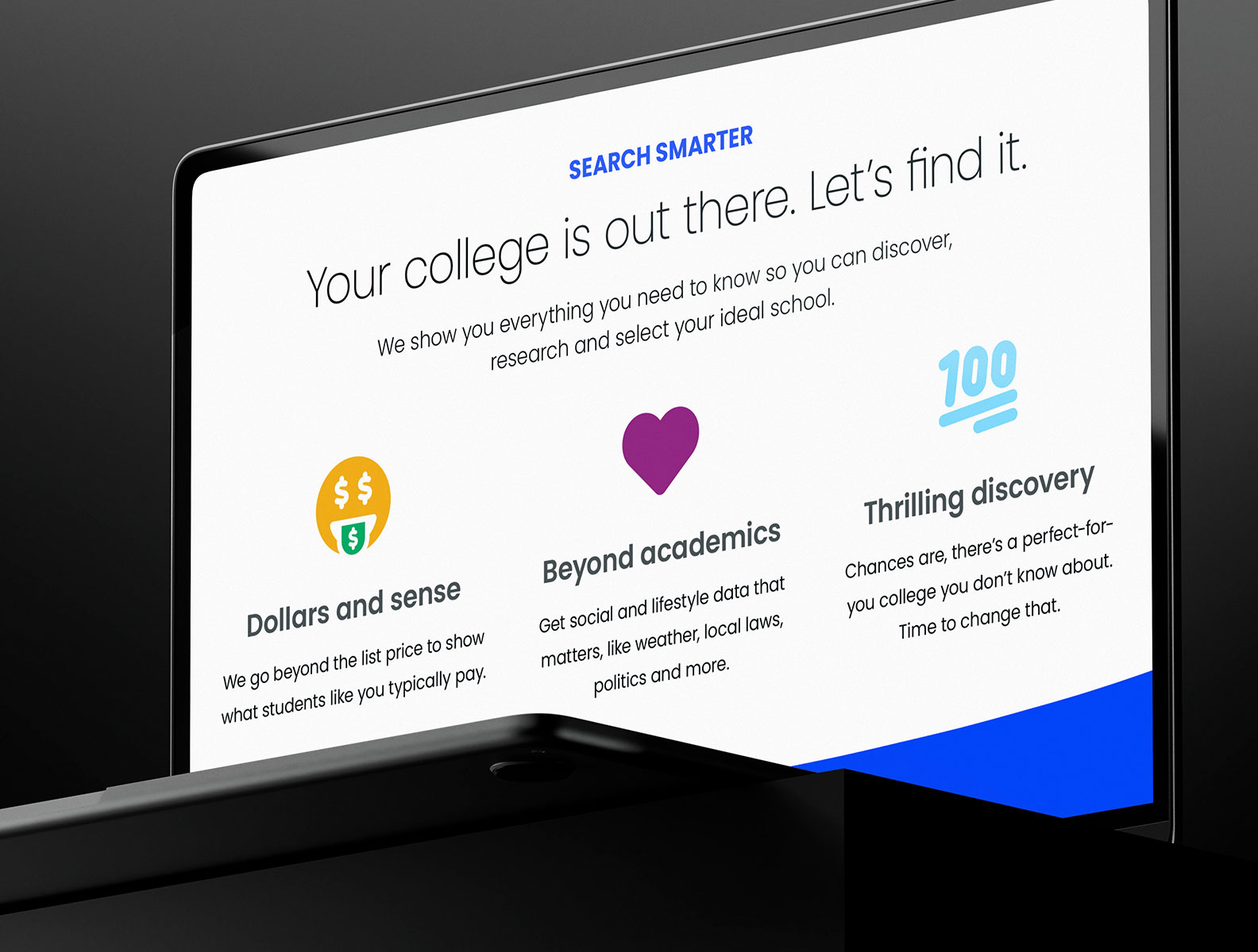
A website that makes it easier for students and their parents to find the right college for them. The right college is more than just the costs and acceptable grades; what about which part of the country, politics, walkability, and way, way more?

The Solution

The solution was to build an easy-to-navigate, comprehensive website built to showcase more than 1500 colleges across the US. The site needed to bring together data from multiple sources, and make the information presentable.

The Results

Clean branding, amazingly detailed design, easy-to-maintain website, and integrations that make future data importing a sinch. The site is performant and includes structured data to support SEO ranking.

Client Industry

Education

Platform

Website

Technology
  • Laravel
  • Tailwind
  • AlpineJS
  • Miro
  • Adobe Cloud

The Vision

Mission Brief

Our client approached us with a challenge: build a site that helps students and parents find the right college for them. With north of 1500 four-year colleges in the US, they wanted a website that would showcase the diverse nature of the different schools, locations, demographics, laws, and even politics.

Challenges

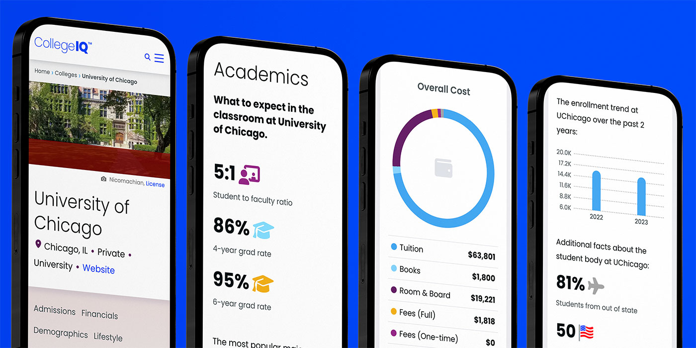
This project offered several unique challenges. The most significant challenge was designing and displaying the breadth of data required to comprehensively present each college. The data needed to include admissions, academic, demographic, lifestyle and housing information for each school.

Our client had sources most of the data but the Ravenna team had to setup the initial data and also a process for keeping it up to date via API.

Why Ravenna?

Our experience with clients, large and small, influenced our client's decision to select Ravenna for this project. Additionally, they felt confident in our ability to handle the design and development of a site with this much information.

The Solution

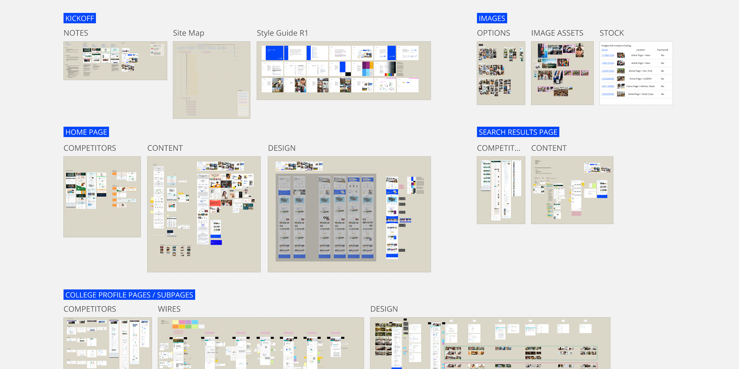
The CollegeIQ website is the culmination of a wide variety of solutions. One of the solutions we offer is that we become experts in what our clients are trying to accomplish. This project was no different. We began by wrapping our arms around the breadth of data, mapping it out with wireframes, and then building the code to support it.

The wireframing process was vital to the solution, from categorizing the data and identifying a clear hierarchy to triangulating what database fields were required to output a particular graph. It was critical to plan each page to accurately see where something went and what data was necessary to show it.

The solution also involved sourcing data. From weather data to using AI to help draft dynamic pieces of content, it was essential to get creative to deliver the quality necessary for this project.

Brand + Identity

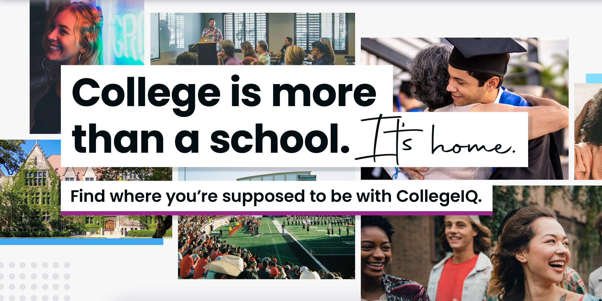
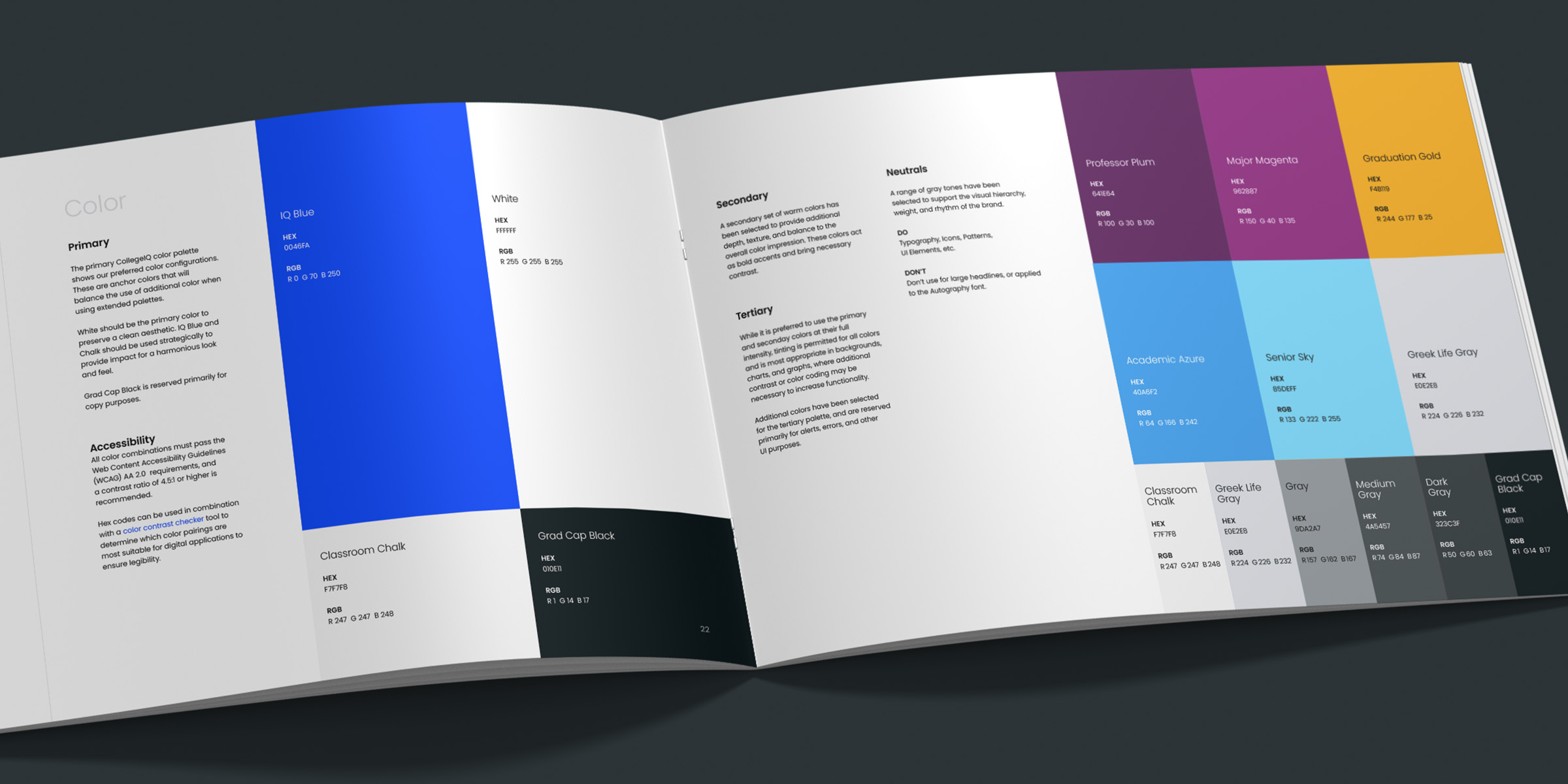
From a visual perspective, the first step was creating a brand that would resonate with the client’s younger audience. Wanting the colleges to be the stars, we prioritized simplicity and clarity for the CollegeIQ brand.

We quickly developed a clean and bold visual identity package: a logo, a typography set, a robust color palette, an extensive icon library, and custom infographics. We balanced these design elements with diverse, lifestyle-driven imagery to create a wide-reaching, relatable vibe — reflective of the college experience while remaining mindful that each student’s journey is unique.

The result was an approachable and memorable brand that stands apart from competitors and speaks directly to the target audience.

UI/UX + Design

The site design was centered around usability and clarity. We conducted focused user testing to ensure the design resonated with our younger audience. We kept the interface clean and uncluttered, allowing vibrant images and detailed information from the colleges to take center stage.

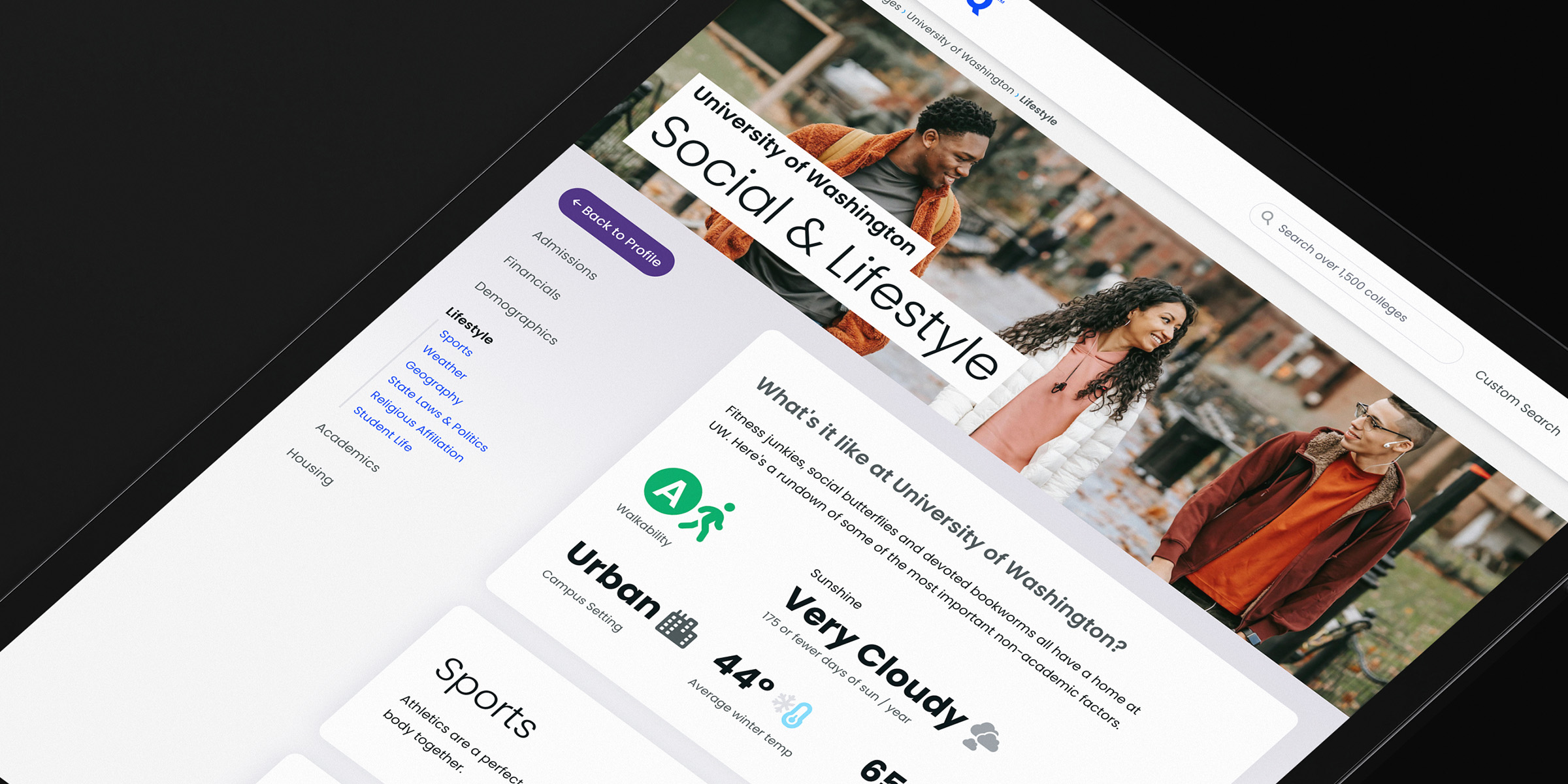
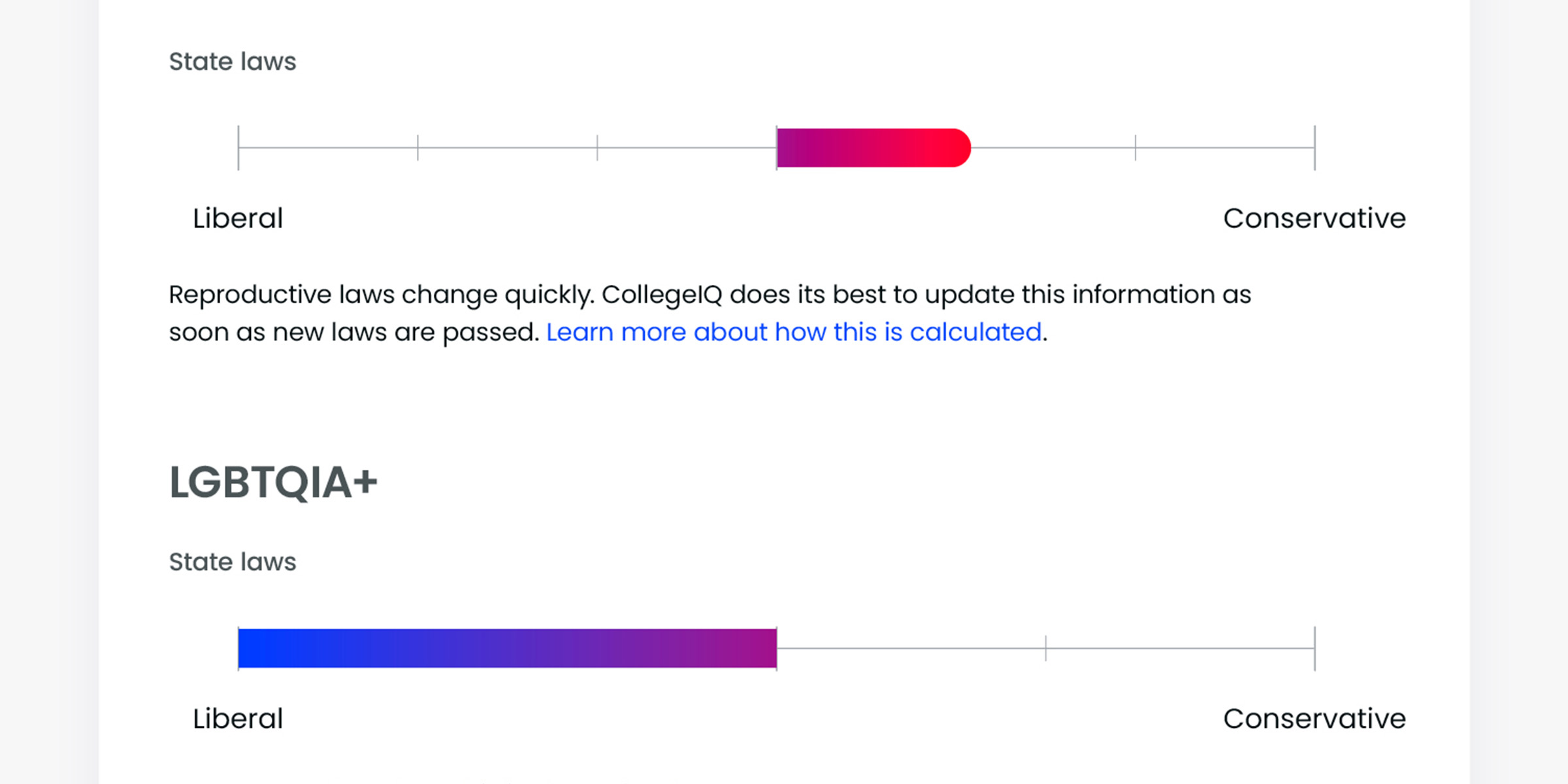
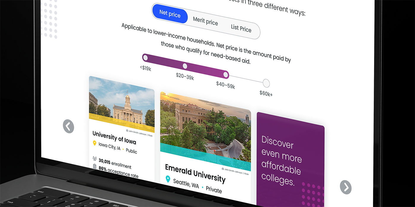
One key challenge was visually organizing large amounts of data in a way that was easy to scan and digest without overwhelming users. We solved this by establishing clear type and data hierarchies, pairing key stats with iconography, and creating eye-catching infographics to simplify complex data and comparisons at a glance.

Development

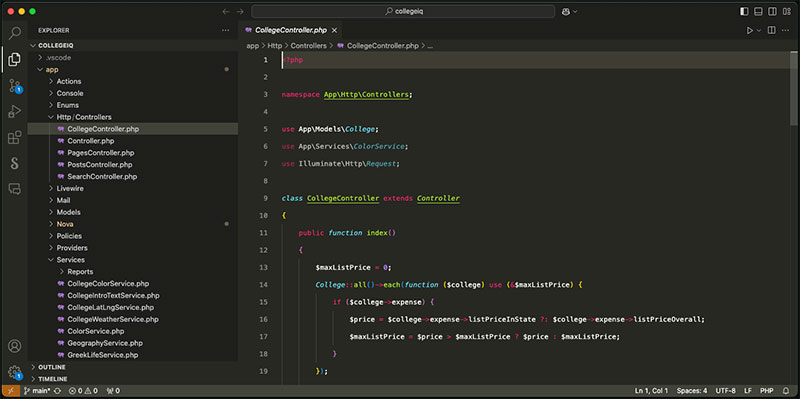
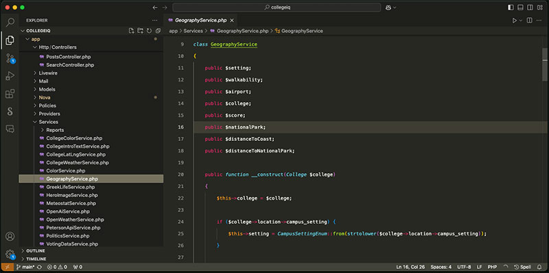
CollegeIQ is built with Laravel, Livewire, Alpine, and Tailwind, the TALL stack. This project presented some interesting data challenges.

First, each quarter, multiple data providers update their data. So, we developed an integration that can be run anytime to pull in new data. But sometimes, the latest data is a patch to existing data. And to add a layer of complexity is two things:

  • Site admins can update data, but they don't want that overwritten during a data update.

  • Each year, there is new data from the previous year.

Using a hybrid setup with Spatie's ActivityLog and some model events, we could monitor changes without overwriting admin updates.

The next challenge was to create a robust search and filter system. The information for each college accounts for hundreds of database columns. The breadth of the data and the need to make the search and filter system easy to use required careful planning and implementation.

Searching on the site feels intuitive and fun.

I went to Ravenna Interactive with a good idea of what I wanted my end product to look like but unsure how to get there. Ravenna was the perfect team to see it to execution because it had both the design and development resources in-house. The team delivered a beautiful, fast, and scalable website.

Andrew Allemann Founder, CollegeIQ

The Results

While the results of this project speak for themselves, a few things are worth highlighting.

First, the site is beautiful. The branding is clean and fun; the site engages you from the first moment.

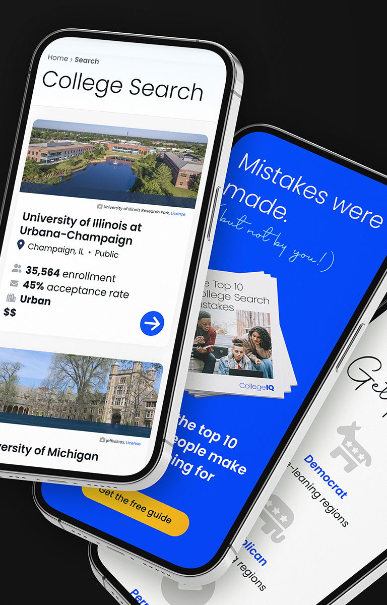
Second, The site has a very robust search system. There are two ways to search. The first is via the dynamic search bar in the header and the homepage hero area. The dynamic search enables visitors to search across states, colleges, majors, and more. The second is a diverse filter system available on the left rail of the search page. Filters for a wide array of items are cleanly laid out in a way that is digestible and easy to navigate.

Third, the underlying Laravel code is built to scale and support a breadth of data that, upfront, does not seem like that much, but when you dig in, you find a ton of complexity.