

 James Hamann — September 24th, 2024
We can use native HTML elements. We can use Alpine. We can use Tailwind. We can rock out.
The internet is awash with sliders. You’ve probably seen many like this:
 https://codepen.io/predragdavidovic/pen/mdpMoWo
If you are a developer, you’ve probably thought, “That looks complicated to build.” You’re wrong! Follow the link in the caption, and you’ll see that it isn’t too complicated, even with native CSS and Javascript. For us, TALL (Tailwind, Alpine, Laravel, Livewire) peeps its dead simple.
Let’s break down what this component is. Using native elements, it is simply two range inputs, your minimum and maximum. It is trivial to stack two ranges like this on top of each other:
<div class="min-h-screen min-w-screen flex justify-center items-center">
  <div class="w-96">
    <div class="relative">
      <input type="range" value="0" min="0" step="1" max="100" class="absolute top-0 left-0 w-full" />
      <input type="range" min="0" value="100" step="1" max="100" class="absolute top-0 left-0 w-full" />
    </div>
  </div>
</div>
Step 1
Alright, we have our minimum and maximum “thumb” elements (the circles) and, visually, a single “bar,” which, as we know, is actually two range elements. However, you will notice that it doesn’t quite work. We can only interact with the second range because it sits atop the first one. We are going to have to remove the default styles on the range elements and style them ourselves, including support for WebKit browsers and Firefox:
<div class="min-h-screen min-w-screen flex justify-center items-center">
  <div class="w-96">
    <div class="relative h-2">
      <input type="range" value="0" min="0" step="1" max="100" class="min-range absolute top-0 left-0 w-full appearance-none pointer-events-none bg-neutral-300 rounded-md h-full z-0" />
      <input type="range" min="0" value="100" step="1" max="100" class="max-range absolute top-0 left-0 w-full appearance-none pointer-events-none bg-neutral-300 rounded-md h-full z-0 bg-transparent" />
    </div>
  </div>
</div>
And some CSS:
.min-range::-webkit-slider-thumb, .max-range::-webkit-slider-thumb {
  appearance: none;
  background: blue;
  width: 1rem;
  height: 1rem;
  pointer-events: auto;
  position: relative;
  cursor: pointer;
  z-index: 10;
  border-radius: 50%;
}

.min-range::-moz-range-thumb, .min-range::-moz-range-thumb {
  appearance: none;
  background: blue;
  width: 1rem;
  height: 1rem;
  pointer-events: auto;
  position: relative;
  cursor: pointer;
  z-index: 10;
  border-radius: 50%;
}
Step 2
Honestly, this is probably the most cumbersome part of the process. While we can use tailwind to style the range bars, we need to style the thumbs separately using vendor prefixes. As of September 2024, Tailwind doesn’t have a way to style those pseudo elements. Targeting specific behavior for browsers is not fun, and overriding default styling is also not fun. Thankfully, while hacky, this method works and allows us to unify styles across major browsers. We now have two thumbs that can be interacted with independently and slide up or down over a single visual bar.
Critically, we removed the background color for the “max” range element. We also removed pointer events for both range bars. By making only the thumbs interactive we removed confusing behavior the user would encounter when hitting the bars. It is reasonable to expect hitting the bar to the right of the max thumb would move the max thumb to the right. The inverse is true of hitting to the left of the min thumb. But what about any hits in between? Does the user mean to interact with the minimum, or the maximum? There is no way of knowing, and any guess by us would undoubtedly result in frustration for the user. So, we remove the ambiguity altogether. To interact with the range, you interact with the thumbs.
While the user can interact with the thumbs, they can move them past each other across the bar. Not really ideal for setting a minimum and maximum value. Also, we aren’t displaying any label to the user that helps them understand their selection. Let’s fix those things now with a little Alpine JS:
<div
     x-data="{
             min: 0,
             max: 100,
             gap: 10,
             handleMinInput(val) {
               this.min = Math.min(val, this.max - this.gap)
             },
             handleMaxInput(val) {
               this.max = Math.max(val, this.min + this.gap)
             }
             }"
     class="min-h-screen min-w-screen flex justify-center items-center"
     @change="console.log({min, max})"
>
  <div
       class="w-96"
  >
    <div class="relative h-2">
      <input @input="handleMinInput($event.target.value)" x-ref="min" type="range" value="0" min="0" step="1" max="100" x-model="min" class="min-range absolute top-0 left-0 w-full appearance-none pointer-events-none bg-neutral-300 rounded-md h-full z-0" />
      <input @input="handleMaxInput($event.target.value)" x-ref="max" type="range" min="0" value="100" step="1" x-model="max" max="100" class="max-range absolute top-0 left-0 w-full appearance-none pointer-events-none rounded-md h-full z-0 bg-transparent" />
    </div>
    <div class="flex justify-between text-md mt-4">
      <span x-text="min"></span>
      <span x-text="max"></span>
    </div>
  </div>
</div>
Step 3
We start by setting up our Alpine component with an “x-data” attribute. We then set up states for min, max, and a gap and set our handlers for changes to min and max in this attribute.
Next, we add event listeners on the min and max ranges to call their respective handlers. This is done with the “@” syntax in Alpine. We use “@input” because the input event is called while the user changes the range values. Compare this to the “change” event, where the event fires once the user removes focus from the element. In the case of a range element, this is the difference between sliding the range and finally releasing the thumb or mouse. By hooking into the input event, we can prevent the user from sliding the range too far up or down.
Our handlers… handle… this functionality very simply yet effectively. They are constantly resetting the value of the inputs. Sometimes it is to the same value the user selected. However, if the user changes the minimum value to something greater than the maximum, it brings it back down. If they change the maximum value to lower than minimum, it brings it back up. We also use our “gap” state to provide a buffer between the min and max, mathematically and visually. This is all done in one line of code in each handler, using Math.max or Math.min. It couldn’t be simpler! With three pieces of state and a couple of single-line handler functions, we’ve used Alpine to solve this otherwise tricky problem.
I almost forgot that we added the labels to the code as well. With Alpine and the “x-text” directive, this was a piece of cake—just a matter of wiring two spans to the min and max state. The hardest part of this was positioning the elements. How cool is that?
The best thing about this is that we can now treat our Alpine component like a single range element. In our pen, we added a change listener to the parent container, which captures changes to both min and max ranges, letting us put them into a single object. We log the value, but imagine how useful that would be in a real app setting.
Okay, so the astute observer might have noticed that while our functionality is in place, the component is very basic-looking. We aren’t highlighting the range within the component in any way. The selected range looks the same as the unselected portion. Also, in the initial example, the user could manipulate the range with the labels.
Let’s tackle the more complicated part first. Removing the default appearance removed the native highlighting for the range, so we need to add it back in manually. This can be done with a few divs and binding styles to our state:
<div
     x-data="{
             min: 0,
             max: 100,
             gap: 10,
             handleMinInput(val) {
               this.min = Math.min(val, this.max - this.gap)
             },
             handleMaxInput(val) {
               this.max = Math.max(val, this.min + this.gap)
             }
             }"
     class="min-h-screen min-w-screen flex justify-center items-center"
     @change="console.log({min, max})"
>
  <div
       class="w-96"
  >
    <div class="relative h-2" x-ref="parent">
      <input @input="handleMinInput($event.target.value)" x-ref="min" type="range" value="0" min="0" step="1" max="100" x-model="min" class="appearance-none pointer-events-none h-full min-range absolute top-0 left-0 w-full z-1 rounded-md" />
      <input @input="handleMaxInput($event.target.value)" x-ref="max" type="range" min="0" value="100" step="1" x-model="max" max="100" class="appearance-none pointer-events-none h-full max-range bg-gray-300 absolute top-0 left-0 w-full z-1 rounded-md "/>
      <div class="absolute left-1/2 -translate-x-1/2 h-full overflow-x-hidden rounded-md" style="width: calc(100% - 1rem);">
        <div class="absolute pointer-events-none w-full top-1/2 -translate-y-1/2 bg-blue-500 h-full rounded-md z-0"></div>
        <div class="absolute pointer-events-none w-full top-1/2 bg-gray-300 h-full rounded-md z-10" :style="`transform: translate(-${100 - min}%, -50%)`"></div>
        <div class="absolute pointer-events-none w-full top-1/2 bg-gray-300 h-full rounded-md z-10" :style="`transform: translate(${max}%, -50%)`"></div>
      </div>
    </div>
    <div class="flex justify-between text-md mt-4">
      <span x-text="min"></span>
      <span x-text="max"></span>
    </div>
  </div>
</div>
Step 4
You might think we should create a single div and modify its width and placement as the sliders move left and right. This is undoubtedly a way to accomplish what we need and not far from our solution. However, modifying an element's width is more expensive than simply translating that element left and right. While it might seem more complicated, using three divs to simulate the look of a single bar is less computationally expensive and easier to understand.
We inserted a div with three bars next to the ranges, one that mimics the color of the native selected range (with a background of blue) and two that mimic unselected portions (backgrounds of light grey). The “unselected” bars live to the left and right of the component, which has its overflow set to hidden. Using Alpine, we can bind the style of these bars to the state of the min and max values and translate them left or right as the user slides the thumbs. Our example range uses values from 0 to 100, so translating this to a percentage is easy. For different ranges, you’ll have to convert, but if you can’t figure it out, consult your old high school textbook (or Chat GPT)!
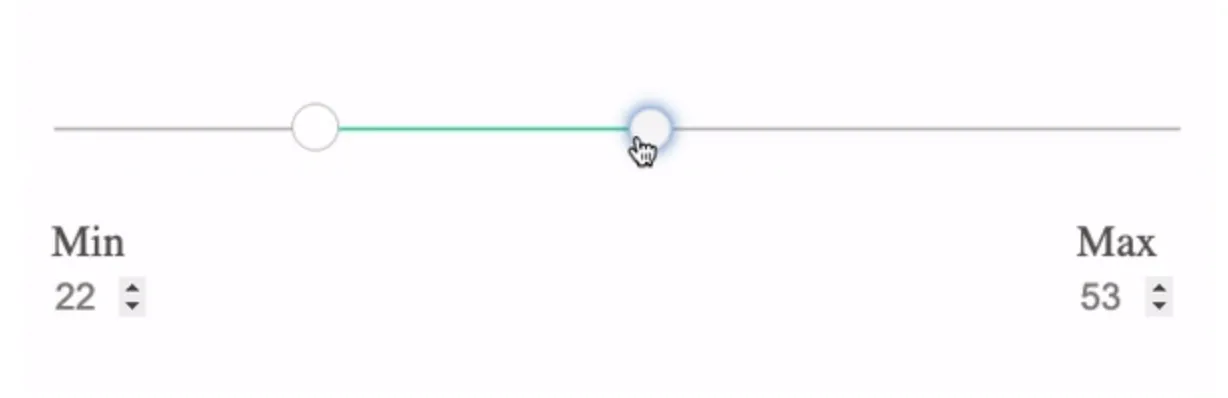
But wait, we almost forgot the ability to change the values in the labels:
<div
     x-data="{
             min: 0,
             max: 100,
             gap: 10,
             handleMinInput(val) {
               this.min = Math.min(val, this.max - this.gap)
             },
             handleMaxInput(val) {
               this.max = Math.max(val, this.min + this.gap)
             }
             }"
     class="min-h-screen min-w-screen flex justify-center items-center"
     @change="console.log({min, max})"
>
  <div
       class="w-96"
  >
    <div class="relative h-2" x-ref="parent">
      <input @input="handleMinInput($event.target.value)" x-ref="min" type="range" value="0" min="0" step="1" max="100" x-model="min" class="appearance-none pointer-events-none h-full min-range absolute top-0 left-0 w-full z-1 rounded-md" />
      <input @input="handleMaxInput($event.target.value)" x-ref="max" type="range" min="0" value="100" step="1" x-model="max" max="100" class="appearance-none pointer-events-none h-full max-range bg-gray-300 absolute top-0 left-0 w-full z-1 rounded-md "/>
      <div class="absolute left-1/2 -translate-x-1/2 h-full overflow-x-hidden rounded-md" style="width: calc(100% - 1rem);">
        <div class="absolute pointer-events-none w-full top-1/2 -translate-y-1/2 bg-blue-500 h-full rounded-md z-0"></div>
        <div class="absolute pointer-events-none w-full top-1/2 bg-gray-300 h-full rounded-md z-10" :style="`transform: translate(-${100 - min}%, -50%)`"></div>
        <div class="absolute pointer-events-none w-full top-1/2 bg-gray-300 h-full rounded-md z-10" :style="`transform: translate(${max}%, -50%)`"></div>
      </div>
    </div>
    <div class="flex justify-between text-md mt-4">
      <input type="number" @input="handleMinInput($event.target.value)" x-model="min" step="1" min="0" max="100" class="show-number" />
      <input type="number" @input="handleMaxInput($event.target.value)" x-model="max" step="1" min="0" max="100" class="show-number" />
    </div>
  </div>
</div>
And a CSS update:
.min-range::-webkit-slider-thumb, .max-range::-webkit-slider-thumb {
  appearance: none;
  background: blue;
  width: 1rem;
  height: 1rem;
  pointer-events: auto;
  position: relative;
  cursor: pointer;
  z-index: 20;
  border-radius: 50%;
}

.show-number::-webkit-inner-spin-button, .min-number::-webkit-outer-spin-button {
  opacity: 1
}

.min-range::-moz-range-thumb, .min-range::-moz-range-thumb {
  appearance: none;
  background: blue;
  width: 1rem;
  height: 1rem;
  pointer-events: auto;
  position: relative;
  cursor: pointer;
  z-index: 20;
  border-radius: 50%;
}
Step 5
Unfortunately, we need to rely on shoddily supported pseudo element styling to have the number controls, or “spinners,” always show for the user. And this effect only works in Chrome. But, by changing the labels to use number inputs instead of spans and tying them to the same state as the ranges, they offer the same control and responsiveness. We also call the same handlers on the input events, and because we put the change event handler on the parent, it captures the user changes automatically. Amazing!
There you have it, a min-max range slider that looks and behaves natively, done with a bit of CSS styling and minimal javascript thanks to Alpine JS—a few things worth noting. The accessibility of this component has not been tested, so things like compatibility with screen readers and focus events. Because it utilizes native inputs, it should be close to great, but it is still worth testing. Also, before taking it into production, it is probably worth looking into an alternative solution for the number field controls, something more cross-browser compatible. However, as it stands, it is a great component that behaves very much like a native dual-slider range component would.
Hope this tutorial was helpful. Happy coding out there!